
‘Make things as simple as possible, but not simpler’ is the user-friendly paraphrase of a quote from a lecture Albert Einstein delivered at Oxford in 1933. It is a wonderful irony that Einstein was proven wrong (by the composer Roger Sessions) in that he didn’t make the quote itself ‘as simple as possible’, necessitating subsequent improvements.
He also said other things. For example, when some kids where playing on his patio where concrete did not fully set, he allegedly yelled at them, later justifying the yelling with “I love children in ze abstract, not in ze concrete”. We will leave the application of the Einstein’s Gulf to his personal life for another time and focus instead on the problem of simplicity.
My designer colleague Kim Peter shared a blog post recently about LayerVault’s approach to this balancing act called progressive reduction. In a nut shell, LayerVault proposes initial user experience that is helpful and descriptive, only to be made ‘tighter’ and simpler as the user gains proficiency. This progress is supposed to be automatic (by tracking activity) – no explicit declaration from a user required (‘I am so an expert now, honestly’). The concept also provides for users being downgraded due to lack of recent activity.

The concept is not new but pairing it with usage monitoring caught my attention. I discussed it with my colleagues and got mixed reaction. As a team, we became allergic to solutions that seem overtly ‘magical’, and UI that changes between two visits without the explicit gesture definitely falls into that class (I am looking at you, Microsoft Word 2003 menus). However, designers are inexplicably drawn to the siren call of ‘the perfect interface’ where things cannot be ‘made simpler’. Look at all the gushing over the evolution of the Starbucks logo, resulting in the removal of the company name (Starbucks reckons we are all expert coffee drinkers by now and need no hand holding in locating the nearest source of developer’s nectar).
Progressive reduction reminded me of another user experience technique – progressive disclosure. When I was on the Eclipse team, we had been tasked with solving a somewhat different problem IBM was experiencing with some of its large desktop applications (you can read the presentation about it by a former Eclipse colleague Kim Horne; favorite part: user.brain.OutOfMemoryError). They had so many features that the out of the box experience had some of the ‘747 cockpit’ feel to it. The fix of that bug was to hide most of the features and slowly reveal them as the user goes about his daily tasks (‘only if you answer these questions three, the other side of the UI you’ll see‘).
We spent a lot of time discussing whether the true fix was to ruthlessly edit the UI, or declare that all the dials and switches are required in order to actually fly the 747. On the topic of feature editing, I remember that Kevin Haaland, my manager and Eclipse Platform project manager at that time, made a distinction between true, or systemic and fake or accidental complexity, of which only the former actually matters, the latter being a by-product of things being cobbled together without enough thought about the end result. I also developed a distaste for our lack of backbone in making a design decisions, resulting in delegating too many choices to the users via a massive preference dialog (300 individual preference panels in one instance). Even the 747 cockpit has evolved to become much more streamlined and pilot-friendly – I guess we need to look for another metaphor. Oh, and progressive disclosure was ‘magical’ too – the features in the UI appeared on their own, not as a result of an explicit action.
It is no accident that progressive disclosure is not mentioned as frequently nowadays with Web or mobile applications. For the former, people are experiencing your site through the peephole of one page at a time, so it can be enormous and you only need to worry about the complexity of a single page (unless you include links to 300 other pages). And on mobile devices, it is really hard to create a mobile app with too many features due to the natural restrictions of the medium.
Perhaps another reason it is not spelled out is because it graduated into the ‘duh’ status – of course you will provide a clean initial interface and hide secondary and tertiary functionality behind menus, slots, drawers and other UI elements for stashing things away. It is just good design, nothing to see here, moving on.
Progressive reduction is a different beast altogether and is concerned with reconfiguring the experience with the level of expertise as it changes.
I think the thought process that led to progressive reduction was as follows:
- We worked hard with our target audience to ensure all the features in the product are actually wanted and sought after
- We like clean UI so most of the features are stashed away so that the initial experience is as sparse as a Scandinavian living room
- We now have an opposite problem – users unfamiliar with the interface not quickly finding the features they want
- We better put some in-context hand holding – training wheels – until the user is confident with the UI
- Once the user is confident with the UI, he will start resenting the hand holding
- Users are too busy to click on the ‘dismiss the training wheels’ button, so the UI should ‘sense’ when to reconfigure itself
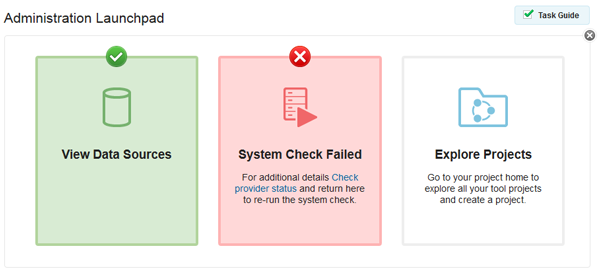
I am fine with most of this progression, except the claim number 6. In-context guidance is a welcome concept as long as it right beside the UI it is related to and can be easily dismissed. But I have an issue with the claim that we need to take the act of explicit dismissal away from the users and base it instead on usage. A UI that flexes from descriptive to streamlined can easily be toggled between these modes with a gesture in a more predictable fashion, and with a minimal workload overhead (and no overhead of tracking and storing usage data). For example, task guides in the Jazz Platform prototype can be explicitly dismissed and they stay closed until summoned again:
My misgivings with the automated part notwithstanding, I liked the article and I think the takeaway message is to separate the modes of presentation (beginner, expert) and how the UI switches between the modes (explicit action or some kind of magic). As you can guess, I am biased towards ‘no surprises’ UI and an explicit gesture to make the UI progressively simpler (beginner>normal>expert modes) is perfectly fine with me. However, I don’t want the UI itself deciding what level of simplicity I deserve at any point in time, and if I was a bad boy and should be downgraded to the training wheels for the failure of visiting the page often enough.
© Dejan Glozic, 2013

Leave a comment