It seems that every couple of years we feel a collective urge to give a technique a catchy acronym in order to speed up conversation about UI design. Last couple of years, we grew accustomed to throwing around the term Responsive Design casually, probably because it rolls off the tongue easier then “we need to make the UI, like, re-jiggle itself on each thingy”. Although I like saying ‘re-jiggle’. Re-swizzle is my close second.
As we were working on the tech preview of the Jazz Platform Home app, we naturally wanted it to behave on phones and tablets. And it did. The header in particular is a breathing, living thing, going through a number of metamorphoses until a desktop caterpillar turns into a mobile butterfly:
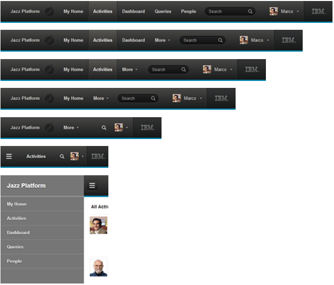
It all works very well, but a (butter)fly in the ointment is that we need to send the markup for both the caterpillar and the butterfly on each request. We do CSS media query transformations to make them do what we want, but we are clearly suboptimal here. I am sure that with some CSS shenanigans we could pull it off with one set of HTML tags, but at some point it just becomes too hard and error-prone. Clearly it is one thing to make the desktop/tablet header drop elements and adjust with screen size, and another to switch to a completely new element (off-screen navigation) while keeping the former rotting in the display:none hell.
This is not the only example where we had to use this technique. The next example has the section switcher in the Project Details page go from vertical set of tabs to a horizontal icon bar:

Again, both markups are sent to the client, and switched in and out by CSS as needed. This may seem minor but in a more complex page you may end up sending too much stuff on all clients. We need to involve the server into this using some kind of a hybrid technique.
As JJG before, Luke Wroblewski has not actually invented this technique but simply put a name on it. RESS stands for REsponsive design + Server Side and first appeared in Luke’s article in 2011. The technique calls for involving the server in responsive design so that only what is needed is sent to the client. It also goes by the name ‘adaptive design’. The server is not meant to replace but rather complement responsive design. You can view the server as a more coarse-grained player in this duo, sending ‘mobile’ or ‘desktop’ stuff to the client, while the responsive design takes care of adapting to the device in more steps or decision points. It needs to because what does it mean ‘mobile’ today anyway? There is a continuum of screen sizes now, from phones to phablets to mini-tablets to regular tables to small laptop screens to desktops – what is ‘mobile’ in that context?
It seems like RESS would help us in our two examples above by allowing us to not send the desktop header to the phone and off-screen navigation to the desktop. However, the server has limited means to perform device detection. At the very bottom, there is HTTP header ‘user-agent’. Agent sniffing is a never-ending task because of new devices that keep coming online. There is a lot of virtual ink spilled on the algorithms that will correctly detect what you are running. This is error-prone activity relying on pattern matching against lists that normally go stale if not updated constantly. There were attempts to subcontract this job, but many are either stack-specific or fee-based (such as WURFL or detectmobilebrowsers.mobi), or a combination of all these approaches. I don’t see how any of these solutions make sense to most of the web sites that want to go the RESS route. Simply judging by the number of available solutions, you can see that this is not a solved problem, analogous to the number of hair loss treatments.
Another approach we can use (or combine with user agent detection) is to send the viewport size to the server in a cookie. This arms the server with the additional means to make correct decision because while, say, iPad is reported as ‘mobile’, it has enough resolution to be sent a full desktop version of the page, and viewport size would reveal that. The problem with this technique is that your site needs to be visited at least once to give JavaScript a chance to set the cookie, which means that the optimization only kicks in on repeat visits.
Considering the imprecise nature of device detection, you should consider RESS a one-two approach – server tries its best to detect the device and send the appropriate content, then responsive design on the client kicks in. A prudent approach would be to err on the safe side on the server and give up on device detection at the first sign of trouble, letting the client do its thing (when, say, user-agent has never been seen before or cookies are disabled preventing viewport size transmission). With this approach, we should ensure that client-side responsive design works well on its own, and consider server-side an optimization, a bonus feature that kicks in for the most straightforward cases (i.e. most well known phones, tablets) and/or on repeat visits.
By using the vision analogy, the most you would expect your server to do in a RESS-enabled site is to tell you that the vehicle on the road is a car and not a truck, and that it is black(ish). As long as you don’t expect it to tell you that it is a 2012 BMW i3 with leather seats and technology package, you will be OK.
© Dejan Glozic, 2013
 Dejan Glozic